Standard Goods Re-design

Client: TheStandardGoods.com

Standard Goods is a boutique in Capitol Hill, selling unique designer collections. They specialize on products crafted in North America.

Duration : 2 weeks sprint

Process: Research, Competitive analysis, Task Analysis, Affinity diagramming , Customer Journey, Sketching, Storyboarding, Card sort, Site map, Wireframes, User Interface Design, Rapid Prototyping, User Testing.

Tools : Photoshop, Omnigraffle and InVision.

Challenge


The challenge is to identify things to improve and make the website more user friendly. Specifically, I had to identify:

  • Better and meaningful ways to organize and group products (Information Architecture).
  • Where in the process of purchasing a product, an user gets stuck.
  • How to engage and guide the users in completing the purchase.

Research


Business Analysis

I started by getting to know StandardGoods:

  • Core values.
  • Competitors.

Business Goals

  • Increase in Online Sales.
  • High customer satisfaction, by adding customer reviews to the site.

Competitive and Comparative Analysis

I chose competitors like Totokaelo and Anthropologie for the competitive analysis. After comparing features, I identified answers to the following questions.

  • What is StandardGoods doing the best ?
  • How can the checkout process be made simple and clear to the buyer ?
  • Which features need improvement ?
  • How can the product grouping be made better?

Persona


UX Vision

UX vision for this project is to help the users by simplifying the shopping online experience. Some of the biggest pain points of Dexter are

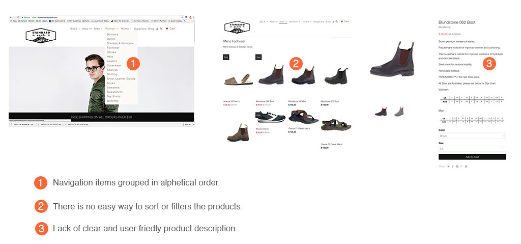
  • He was confused by the way the products are grouped. 
  • No easy way to filter and sort products.
  • Very little information about the products and no reviews.
  • Methods of payment are not obvious.


Design


Usability Testing:


I created an initial version of wireframes for the improved site and put it through usability testing with multiple users. The Before and After snapshots below show how the wireframes evolved during the testing phase.

Before

After


The users felt the masthead needed extra whitespace. So, I iterated my wireframe to incorporate user feedback.


Before

After


While testing, users felt there was no clear visual indication if the "Add to cart" operation succeeded. If the users wanted to checkout at this point, there was no obvious way to do it. I solved these problems by changing the color of the "Add to cart" button to gray when clicked and revealing a new button to proceed with checkout.


Before

After


The methods of payment weren't clear. Specifically the credit card options were not obviously displayed misleading the users. I solved this problem by redesigning the checkout flow.


Wireframe

For more wires click here.....


Prototype


Checkout the prototype below:

Contact